```{=html} ``` For this project, we will use data from the [Bekeley Earth](http://berkeleyearth.org/data/) They provide detailed summary of raw land-surface average in this [dataset](https://berkeley-earth-temperature.s3.us-west-1.amazonaws.com/Global/Raw_TAVG_complete.txt). ##### Using the [file header](https://berkeley-earth-temperature.s3.us-west-1.amazonaws.com/Global/Raw_TAVG_complete.txt), report: - Which unit is used for the temperatures, Celsius or Fahrenheit? - Which time period for the reference is used? - Which character looks appropriate for discarding comments - How can we encode missing data? Reading this kind of fixed-width files is tricky. But `read_table()` will take care of finding the columns. ##### Load the `Raw_TAVG_complete.txt` file as `temp_anomalies`. Use the following tips to guide you. ::: {.callout-tip} ## Tip The only important argument is to specify the header. ``` r c("year", "month", "m_anomaly", "y_anomaly", "y5_anomaly", "y10_anomaly", "y20_anomaly"))) ``` Moreover, we must tell what comment character is used. It might be useful to provide the string used to encode missing data (`%`) and also the columns types. For example, reasonable to ask `year` and `month` to be integer values. ::: ```{r} # Write answer here ``` ##### Is this dataset tidy? ##### Create a date column. Assume that the missing day information is **"01"** for all rows. Assign the result to the name `bky_anomalies` ::: {.callout-tip} ## Tip To create dates, you can use the function `as.Date()` using the string in ISO8601. For example `as.Date("2021-03-15"))` is the date for the 15th of March 2021. ::: ```{r} # Write answer here ``` ##### Plot the yearly anomalies from 1850 (when oil extraction started) using the newly created `date` column. ::: {.callout-tip} ## Tip dots are a good option, but how can we encode the temperature anomalies in a dot since they are usually mapped to the `color` aesthetic? You can use a hollow dot `shape = 21` in `geom_point()` with no stroke (`stroke = 0`) and map the `fill` aesthetic to the yearly anomalies. A relevant gradient could the palette `turbo` from the `scale_fill_viridis_c()` as it offers blues for negative values and reds for positives. You might like a larger gradient legend key, extended to the plot height: ``` r theme(legend.key.height = unit(1, "null")) ``` ::: ```{r} # Write answer here ``` ##### Add a smooth trend line to the previous plot ::: {.callout-tip} ## Tip the default `gam` method proposed by `geom_smooth()` is reasonable enough. You may disable the useless standard error ribbon here. An additional horizontal line on the 0 degree anomalies with a dark dashed line could be a nice addition. ::: ```{r} # Write answer here ``` ##### Plot the temperature anomalies for the last 40 years per month using the polar coordinates and facet per year. ```{r} # Write answer here ``` ##### Which event in 1991 could explained the significant colder years of 1992-1993? ## Could it be the Sun? This is a common argument by climate deniers. They suggest that the Sun could be sending more energy to the Earth and that climate change is not anthropogenic nor due to carbon emissions. Thus, let's investigate this solar activity through time, since yes, the Sun has some cycles. [Sunspots](https://scied.ucar.edu/learning-zone/sun-space-weather/sunspots) can appears and last for several months. Depending on their number and longevity, this can impact the energy the Sun provide around. The dataset [Historical_TSI_Reconstruction](https://spot.colorado.edu/~koppg/TSI/Historical_TSI_Reconstruction.txt) is provided by the University of Colorado. The TSI is *Total Solar Irradiance* and comes as $W/m^2$. ##### Load this fixed-width [dataset](https://spot.colorado.edu/~koppg/TSI/Historical_TSI_Reconstruction.txt) using `read_table`()`. Save object as`tsi\`. ```{r} # Write answer here ``` ##### Create a `date` column. Currently, the date is encoded as doubles with ".5". Let's assume this represents June of each year. Assign the result with the name `tsi_date`. ::: {.callout-tip} ## Tip You should first round the decimal 0.5 with the function `floor()` then add the the string `"-06-01"` to the year, then converting that to a date with `as.Date()` as before. ::: ```{r} # Write answer here ``` ##### Plot the `tsi` per `date` using a line. ```{r} # Write answer here ``` ##### What can we do to make the trend clearer? ##### Smooth the `tsi` ::: {.callout-tip} ## Tip You should have seen this procedure used a lot for Covid-19 infections, usually using rolling means over 7-days. To achieve this, we will use the package [`{slider}`](https://davisvaughan.github.io/slider/) available on CRAN, which proposes the function `slider_mean()`. See example of usage below. ::: ```{r} # see example, from a vector a, we compute a rolling mean of a sliding windows # with either 2 values before or more smooth with 7 tibble(a = c(1, 3, 5, 6, 8, 13, 15), a_avg_2 = slider::slide_mean(a, before = 2), a_avg_7 = slider::slide_mean(a, before = 7)) ``` ##### Add a new column `tsi_ave` which is the rolling mean of the `tsi` using the 10 previous values. Save as `tsi_roll` ```{r} # Write answer here ``` ##### Plot the `tsi_ave` per date. You should observe a more smooth signal. ```{r} # Write answer here ``` ##### The Solar activity appears very low between the years 1620 - 1700, do you know how this period of Middle Age was called? The year 1648 was described as the "year without summer" where many countries experienced severe crop failures. In 1644 and following years, **Hevelius** tracked sunspot with a smart apparatus he designed. See below the kind of drawing he made (source: [Carrasco *et al.* 2019](https://iopscience.iop.org/article/10.3847/1538-4357/ab4ade)): [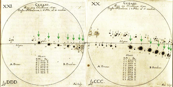](https://iopscience.iop.org/article/10.3847/1538-4357/ab4ade) ##### Looking at the plot below, do you think that the Sun activity could play a role in global warming? 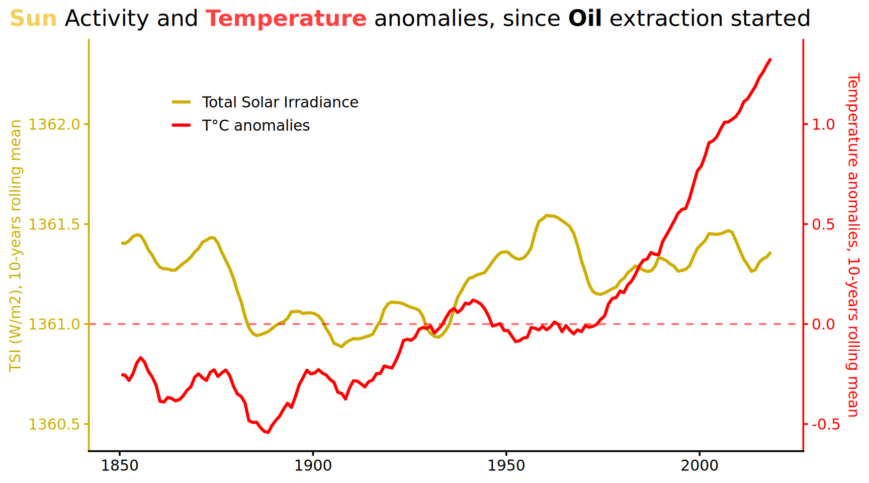 ## Historical insights [Jean-Marc Jancovici](https://fr.wikipedia.org/wiki/Jean-Marc_Jancovici) has a great illustration on how temperature changes impact landscape. 19,500 years ago, the last glacial maximum (LGM) period, the temperatures were in average 5 to 6°C colder. See below a temperature map of Europe during the LGM ([Strandberg et al. 2010](https://onlinelibrary.wiley.com/doi/10.1111/j.1600-0870.2010.00485.x)) {height=200} Luxembourg was mostly frozen all year long. Copenhagen was below meters of ice and France, Germany were covered only by tundras. Sea level was 120 meters lower too. This gives an idea on the impact of a natural change in 19,000 years. We are going to experience, maybe a similar experience in only 100 years, this time triggered by humans and towards hotter temperatures. ## Acknowledgements - [Olivier Boucher](https://emc3.lmd.jussieu.fr/en/group-members/oboucher) - [Jean-Marc Jancovici](https://fr.wikipedia.org/wiki/Jean-Marc_Jancovici) - [Matthieu Auzanneau](https://fr.wikipedia.org/wiki/Matthieu_Auzanneau)NASA GISS data for February 2021 saw a global average temperature anomaly of:
--- Extreme Temperatures Around The World (@extremetemps) March 12, 2021
+0.67C vs. 1951-1980
+0.57C vs. 1961-1990
+0.39C vs. 1971-2000
+0.19C vs. 1981-2010
+0.01C vs. 1991-2020 (map)
which confirms the relatively cool month vs. past few years (see past tweet) https://t.co/wkLtkYxILG pic.twitter.com/hlO1FRQwYD