This practical aims at performing exploratory plots and how-to build layer by layer to be familiar with the grammar of graphics. Moreover, you will practice sorting/collapsing levels of factors that are essentials for ggplot2 categorical variable display.
Those questions are optional
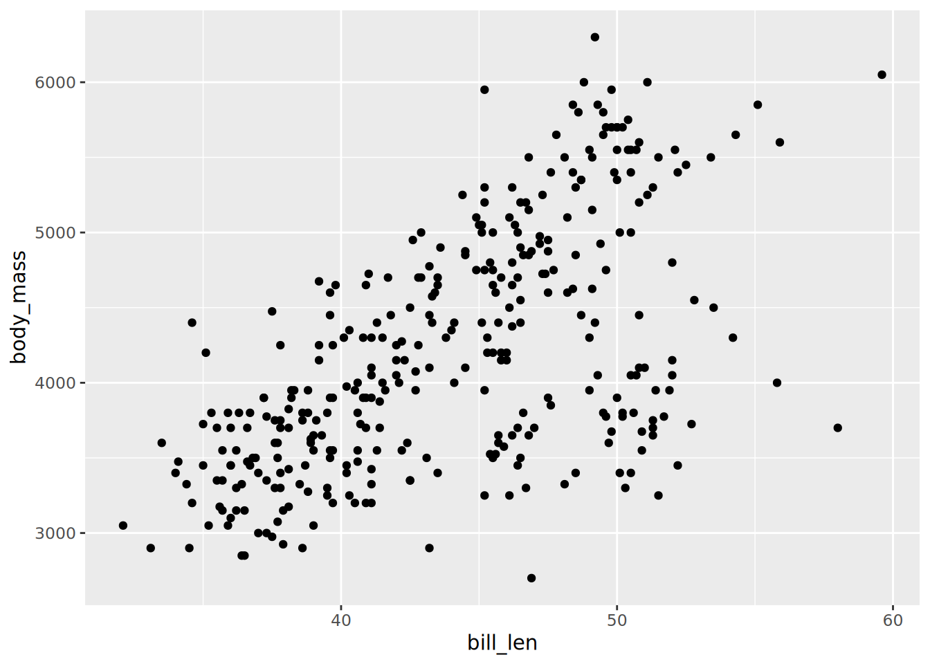
Scatter plots of penguins
The penguins dataset is provided by R itself as a data.frame.
Convert the built-in dataset penguins to a tibble, remove missing data from bill_len and body_mass, assign the name penguins.
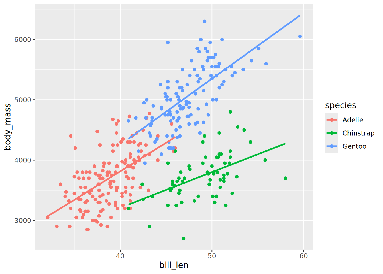
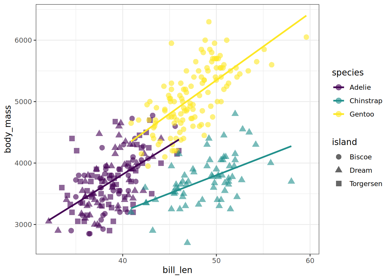
The geom_smooth() layer can be used to add a trend line. Try to overlay it to your scatter plot.
TipTip
By default geom_smooth is using a loess regression (< 1,000 points) and adds standard error intervals.
The method argument can be used to change the regression to a linear one: method = "lm"
to disable the ribbon of standard errors, set se = FALSE
Be careful where the aesthetics are located, so the trend linear lines are also colored per species.
SolutionSolution
penguins |>ggplot(aes(x = bill_len, y = body_mass, colour = species)) +geom_point() +geom_smooth(method ="lm", se =FALSE)
`geom_smooth()` using formula = 'y ~ x'
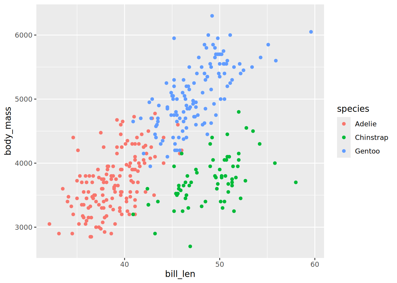
Adjust the aesthetics of point in order to
The shape map to the originated island
A fixed size of 3
A transparency of 40%
TipTip
You should still have only 3 coloured linear trend lines. Otherwise check to which layer your are adding the aesthetic shape. Remember that fixed parameters are to be defined outside aes()
Ajust the colour aesthetic to the ggplot() call to propagate it to both point and regression line.
Try the scale colour viridis for discrete scale (scale_colour_viridis_d())
Try to change the default theme to theme_bw()
SolutionSolution
penguins |>ggplot(aes(x = bill_len, y = body_mass, colour = species)) +geom_point(aes(shape = island), size =3, alpha =0.6) +geom_smooth(method ="lm", se =FALSE, formula ="y ~ x") +scale_colour_viridis_d() +theme_bw()
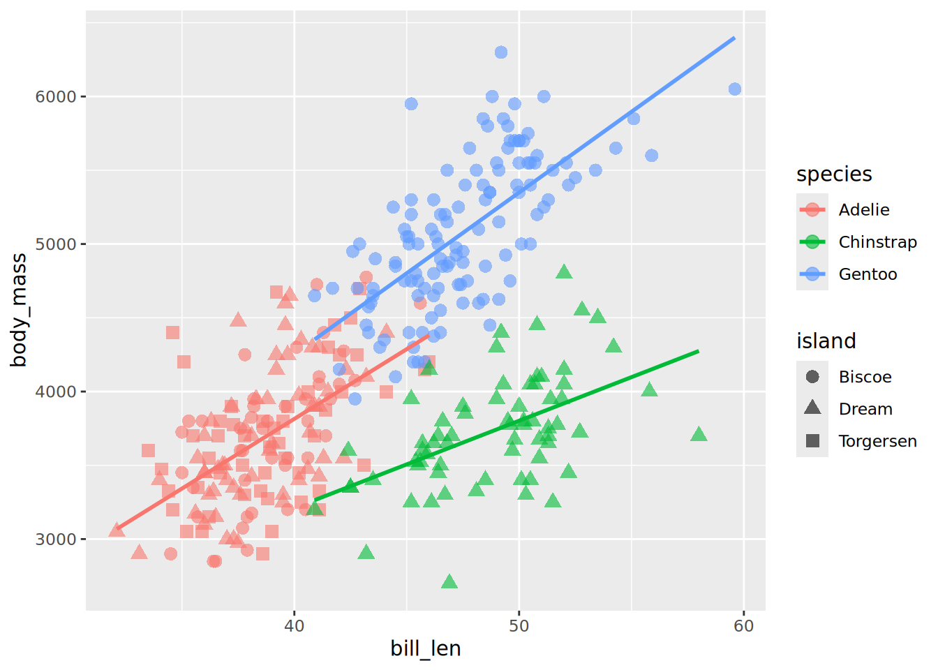
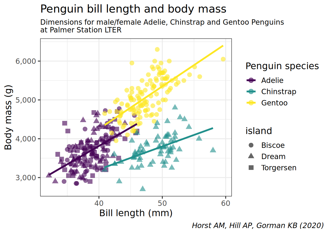
Reproduce the following plot:
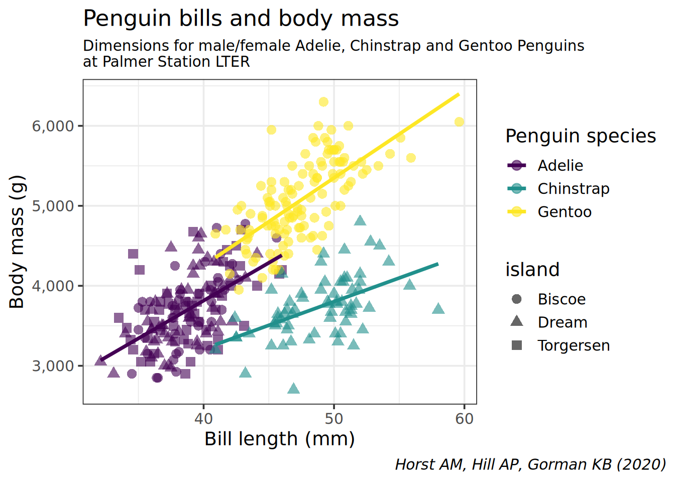
SolutionSolution
penguins |># avoid the missing / non finite valuesdrop_na(bill_len, body_mass) |>ggplot(aes(x = bill_len, y = body_mass, colour = species)) +geom_point(aes(shape = island), size =3, alpha =0.6) +geom_smooth(method ="lm", se =FALSE, formula ="y ~ x") +scale_colour_viridis_d() +theme_bw(14) +theme(plot.caption.position ="plot",plot.caption =element_text(face ="italic"),plot.subtitle =element_text(size =11)) +scale_y_continuous(labels = scales::comma) +labs(title ="Penguin bills and body mass",caption ="Horst AM, Hill AP, Gorman KB (2020)",subtitle ="Dimensions for male/female Adelie, Chinstrap and Gentoo Penguins\nat Palmer Station LTER",x ="Bill length (mm)",y ="Body mass (g)",color ="Penguin species")
TipTip
Remember that:
All aesthetics defined in the ggplot(aes()) command will be inherited by all following layers
aes() of individual geoms are specific (and overwrite the global definition if present).
labs() controls of plot annotations
theme() allows to tweak the plot like theme(plot.caption = element_text(face = "italic")) to render in italic the caption
Categorical data
We are going to use a dataset from the TidyTuesday initiative. Several dataset about the theme deforestation on April 2021 were released, we will focus on the csv called brazil_loss.csv. The dataset columns are described in the linked README and the csv is directly available at this url
Load the brazil_loss.csv file, remove the 2 first columns (entity and code since it is all Brazil) and assign the name brazil_loss
No, the reason for deforestation are in the wide format. Columns commercial_crops to small_scale_clearing should be in the long format
Pivot the deforestation reasons (columns commercial_crops to small_scale_clearing) to the long format. Values are areas in hectares (area_ha is a good column name). Save as brazil_loss_long
year needs to be a categorical data. If you didn’t read the data as character for this column, you can convert it with factor()
geom_col() requires 2 aesthetics
x must be categorical / discrete (see first item)
ymust be continuous
SolutionSolution
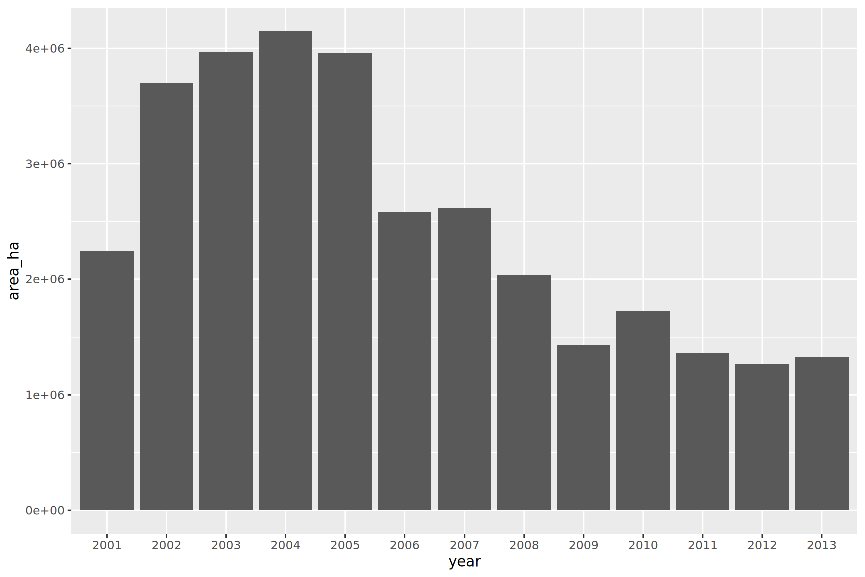
brazil_loss_long |>ggplot(aes(x = year, y = area_ha)) +geom_col()
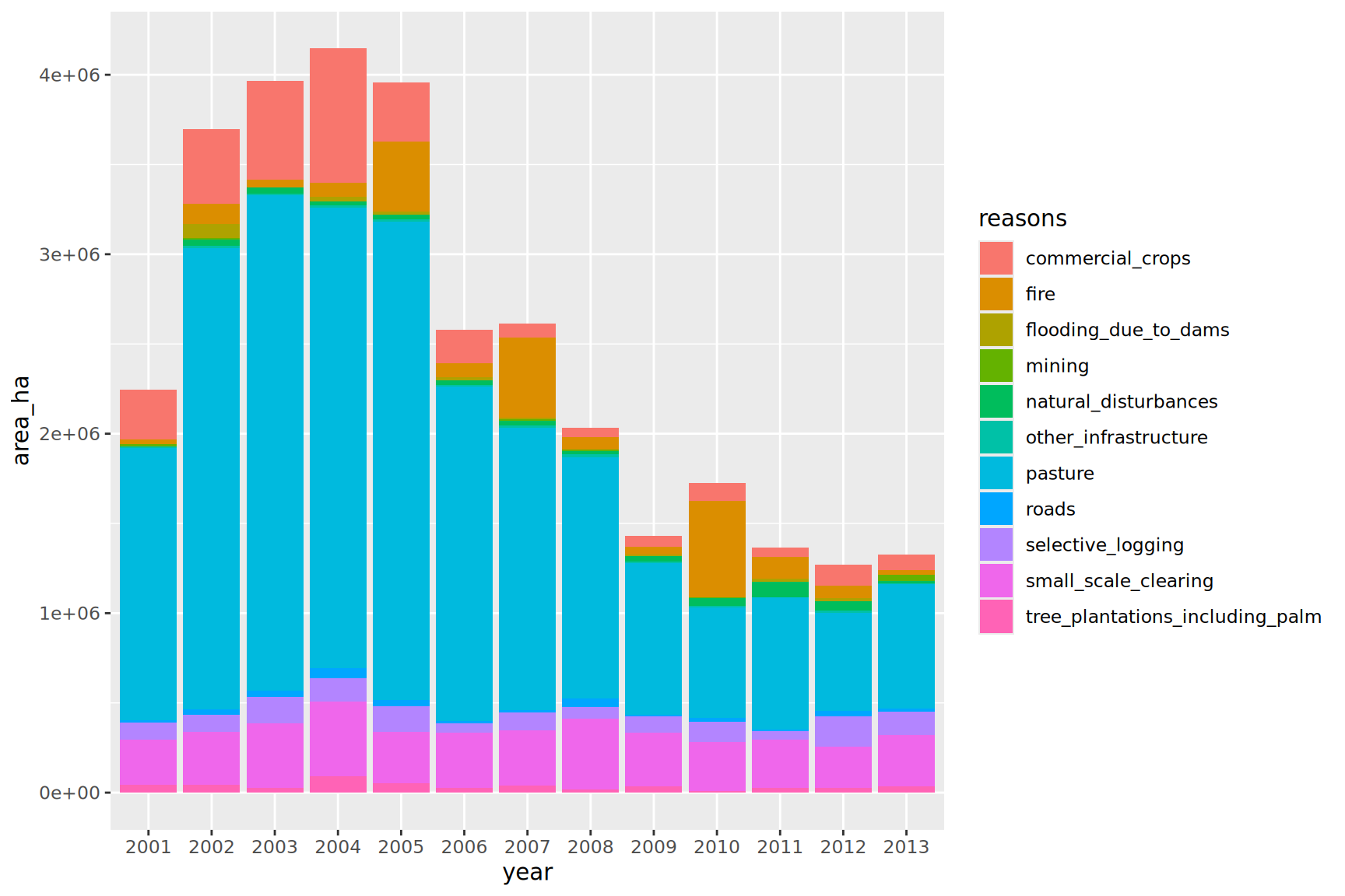
Same as the plot above but bar filled by the reasons for deforestation
SolutionSolution
brazil_loss_long |>ggplot(aes(x = year, y = area_ha, fill = reasons)) +geom_col()
Even if we have too many categories, we can appreciate the amount of natural_disturbances versus the reasons induced by humans.
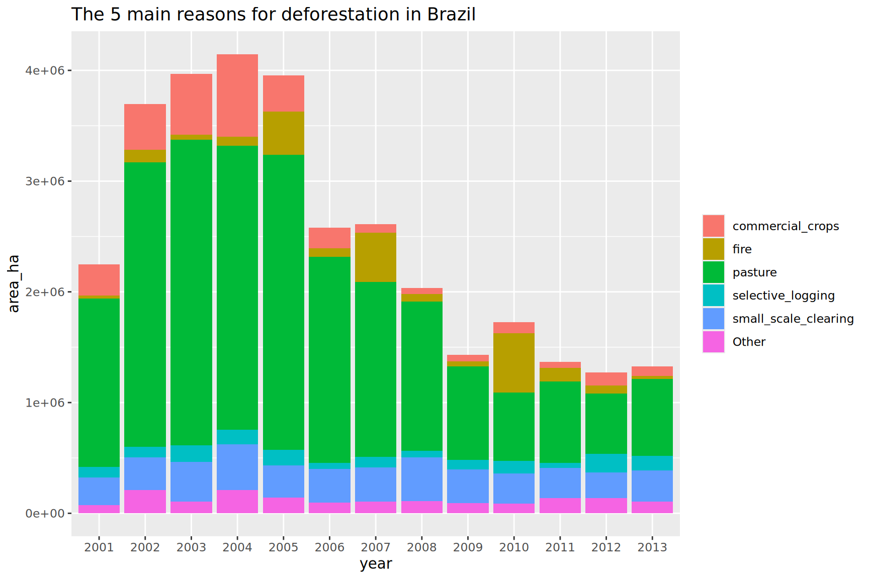
Lump the reasons for deforestations, keeping only the top 5 reasons, lumping as “Other” the rest
TipTip
Use the function fct_lump_n() for this operation. Be careful to weight the categories with the appropriate continuous variable.
The legend of filled colours could be renamed and suppress if the title is explicit
SolutionSolution
brazil_loss_long |>ggplot(aes(x = year, y = area_ha, fill =fct_lump_n(reasons, n =5, w = area_ha))) +geom_col() +labs(title ="The 5 main reasons for deforestation in Brazil",fill =NULL)
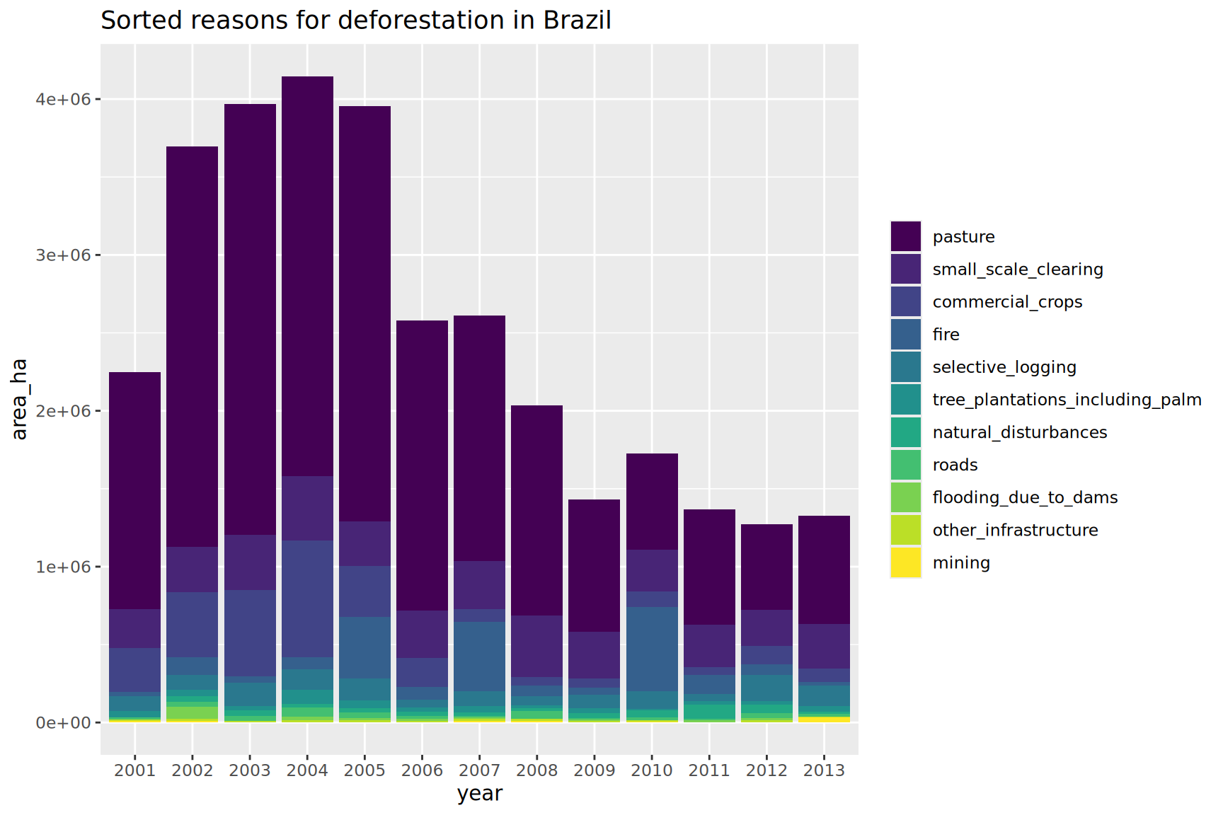
Optimize the previous plot by sorting the main deforestation reasons
TipTip
Since v1.0.0, fct_infreq() does have a weight argument.
you can play with the ordered argument to get a viridis binned color scale
SolutionSolution
brazil_loss_long |>ggplot(aes(x = year, y = area_ha, fill =fct_infreq(reasons, w = area_ha, ordered =TRUE))) +geom_col() +# reverse scale to have top reason in yellowscale_fill_viridis_d(direction =-1) +labs(title ="Sorted reasons for deforestation in Brazil",fill =NULL)
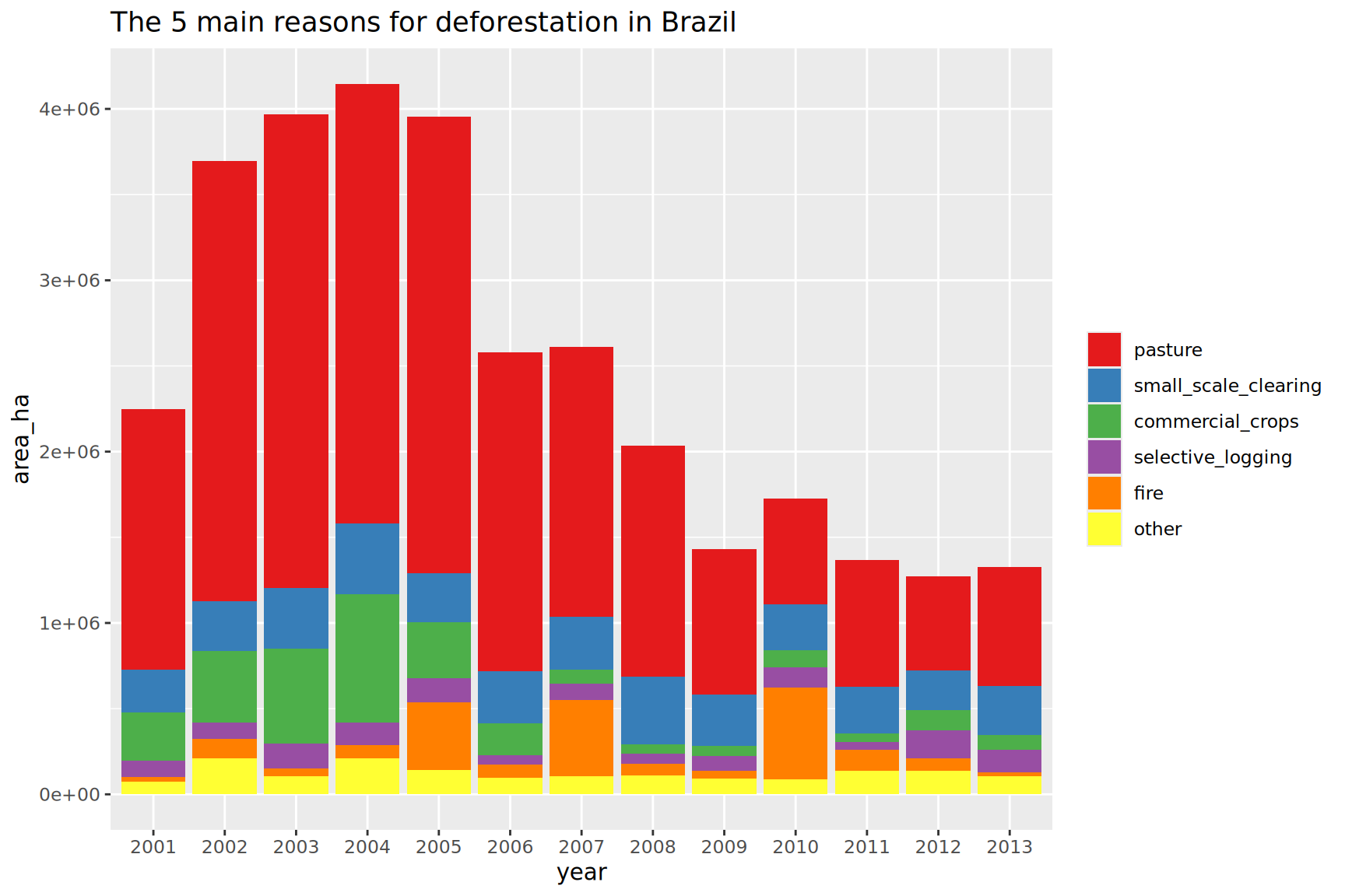
Optimize the previous plot by sorting the 5 main deforestation reasons
TipTip
One solution would be extract the top 5 main reasons using dplyr statements.
Then use this vector to recode the reasons with the reason name when part of the top5 or other if not. Then fct_reorder(reasons2, area_ha) does the correct reordering. You might want to use fct_rev() to have the sorting from top to bottom in the legend.