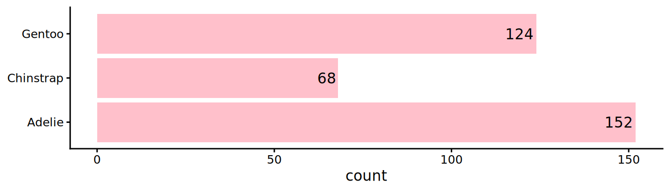
# y mapping to get flipped axis
ggplot(palmerpenguins::penguins, aes(y = species)) +
# geom_bar does count how many penguins are observed for each species
geom_bar(fill = "pink") +
# add count in bars, label is counting, and horizontal adjust is 1.1 to be just before bar height
geom_text(aes(label = scales::comma(after_stat(count))), hjust = 1.1, stat = "count") +
# light theme
theme_classic() +
labs(y = NULL)
Human genome
Parse GENCODE data to summarise some key features of the human genome
Coding regions in the human genome
Download data, set-up
Go on the latest human release of GENCODE .
Download the Comprehensive gene annotation as Content and CHR as Regions. Of note, between GTF
and GFF3
formats, pick the GFF3
one.
Install the bioconductor package rtracklayer
to parse GFF3 files
Import the GFF from GENCODE using rtracklayer::import()
. Assign to the name gencode
.
This steps requires some large memory, such as ~ 4 GB. So your computer needs at least 8 GB to perform this project. The object gencode
below is 1.60 GB alone. Thus, please download in your data
sub-folder the lighter file which contains only 14 chromosomes gencode_light.rds (21 MB). The compressed tsv file can be then loaded using the following command, this object is a tibble, no need to do the import step, go directly to the Explore section.
<- read_tsv("data/gencode_light.tsv.gz") gencode
rtracklayer
is a Bioconductor package. See its homepage for installation instructions.
import
can read directly an URL.import()
returns an object of classGRanges
. Convert to atibble
Of note: This operation takes about 2-3 minutes. You may want to save the object while testing your workflow.
Explore (half if light version) the human genome
First countings
What are the dimensions of this table?
That is way too many lines for the number of genes we expect for the human genome (i.e ~ 20,000 genes).
Look at the column type
. What kind of data is this column?
Display the unique values of the column type
Plot the count of each level from the type
column.
- Sorting the x-axis elements based on the count greatly help the reader to appreciate numbers.
forcats::infreq()
is your friend - Flipping coordinates help to read the x-axis labels. You can map the
y
aesthetic totype
. - Report the counts inside the bars to highlight them. Use
stat = "count"
ingeom_text()
. - A lighter theme like
theme_classic()
is usually better - Title and subtitle in the
labs()
give some context - Large numbers are usually easier to read with thousand comma separators.
scales::label_comma()
does it for you - See the example below to get help (the reordering is on you to find)
From the previous plot, how many gene entries do you have?
What is the rare event of stop_codon_redefined_as_selenocysteine?
Plot the distribution of the number of transcripts per gene
The best columns for transcripts and genes are transcripts_id
and gene_id
. By distribution, we expect the density or binned histogram of the univariate number of transcript per gene. Depending on the distribution shape, log-transforming the counts is an option
On the previous plot, highlight the mean and median
Roughly, how many transcripts per gene do you observe using either the mean or the median in linear scale?
How do you explain the discrepancy between mean or median?
Focus on genes
Now, let’s look at genes only.
Filter the gencode
to restrict rows where type is gene, save as genes
Plot the counts of gene_type
for genes
in the same way you did the type
. Sorting the counts.
You can restrict to counts > 500 to avoid showing all the smaller categories
We can observe quite many unique gene_type
, even restriction to the ones that are present > 500 times.
Collapse the levels of gene_type
to create 4 meta-categories
As follows:
- Protein_coding as prot_coding
- Pseudogene as pseudo
- RNA
- Lump the rest as rest
fct_collapse()
combine with fct_other()
from the forcats
package are good helpers. See below toy example of collapsing levels with “RNA”, then “c” and “d” and finally group the rest in a “rest” level.
<- tibble(type = c("rRNA", "tRNA", "tRNA", "c", "c", "d", "e", "f"))
x # str_subset, will subset a string vector based on a pattern, here: contains "RNA"
<- str_subset(x$type, "RNA")
x_rna |>
x # collapse the rna together (tRNA, rRNA)
mutate(meta_type = fct_collapse(type, RNA = x_rna,
# collapse c and d
cd = c("c", "d")) |>
# the rest is lumped into a "rest" category
fct_other(keep = c("ab", "cd"),
other_level = "rest"))
# A tibble: 8 × 2
type meta_type
<chr> <fct>
1 rRNA rest
2 tRNA rest
3 tRNA rest
4 c cd
5 c cd
6 d cd
7 e rest
8 f rest
Genes per chromosome
Are the genes uniformly distributed across the genome? To address this question, we want to count the number of genes per chromosome and normalizing by the chromosome length.
You can use this file from USCS to get the chromosome sizes.
plot the gene density per chromosome and facet per the 4 meta categories
- For the chromosome sizes, the file is a tabulated file with no header. You can delete all the random and unplaced contigs and keep only the 23 chromosomes + the mitochondrial genome (aka MT). See example below
- For the density, express the number of genes per mega-bases
- For facets, one column makes the plot easier to read
<- c("chr1", "chr2", "MT", "chr6_GL000255v2_alt", "chr16_KI270728v1_random")
chr # accessory chromosomes have an underscore
str_subset(chr, "_")
[1] "chr6_GL000255v2_alt" "chr16_KI270728v1_random"
# use the negate argument to keep the classic chrs
str_subset(chr, "_", negate = TRUE)
[1] "chr1" "chr2" "MT"
Leaving out the pseudogene and other categories, what is striking in the results? What is so special with the MT?
Re-plot filtering out the mitochondria and keeping only prot_coding and RNA
What is the chromosome with the highest gene density?
Gene sizes
How the gene sizes distribution look like? Here we are several questions, we are need to split sequentially. Also, we keep the 4 meta-categories previously obtained since they represent different kind of genes.
Plot the distribution of gene sizes using a density geometry filled by meta-category. The column width
is directly giving you the length in base pairs.
- Some genes have an extreme lengths, log-transformation must be evaluated.
- To keep the axis info in linear scale, you can use the function
annotation_logticks()
- Densities have by default no transparency, you should play with the
alpha
parameter
Which meta-category has the most normal distribution after log-transformation? And the largest average size?
What is roughly the mode of this normal distribution after log-transformation?
Exon sizes
Now we want to compute the gene sizes, excluding the introns. Thus, we need to sum up the exons sizes. Of note, exon in the type
terminology includes also the UTR. To make things easier, we ignore this inclusion and work on the exon whatever it encompasses.
Plot the density of the exon sizes, for this you need to look for the lines with the appropriate type
Do the distributions of exon sizes appear different for the 4 meta-categories?
Sum-up the exons sizes per transcript since genes have usually more than one transcript. Save as transcript_length
Plot the density of the exon sum from transcript_length
Do the distributions of exon sum appear different for the 4 meta-categories?
Intron sizes
Compute the intron sizes
What can make the protein coding bigger then? Maybe the introns. This computation is challenging since we don’t have an easy intron item.
In the type
column associated with the width
column that directly provide the length. The idea is then to work per transcript, and subtract the sum of all exons to the transcript length.
Your workflow could be:
- Select relevant columns, that makes the process easier to control
- Keep per transcript the lines of exons and transcript
- Compute the sum of exons (could add the transcript length, but we have on transcript entry per
transcript_id
) - Move from long to wide format
- Compute the difference transcript_length - sum(exon_length)
- You can ignore intron sum size of 0 as it will prevent you to compute their log values
Plot the density of the intron sums
Plot the distributions of intron sum appear different for the 4 meta-categories
Exon numbers
Compute the number of exons per genes, still colored by the meta-categories
What can you conclude?
Achieve a final plot that is a composition, of the genes, exons, introns sizes and number of exons.
cowplot::plot_grid()
or patchwork
are 2 possibilities to compose ggplots
in one figure. They could share the same legend, as the filling of densities per meta-categories is identical.