mtcars |>
  mutate(transmission = recode(am, `0` = "automatic",
                                   `1` = "manual")) |>
  ggplot(aes(y = transmission)) +
  geom_bar()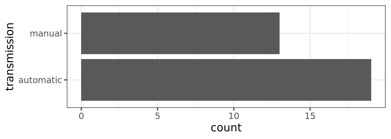
Objective: explore songs using the Spotify API
This dataset comes from the project TidyTuesday where each week a contributor submit a dataset that participants can explore and analyze. Of course, this dataset was obtained from public access but transformed to meet the tidy principles. Here, we are looking at the Spotify dataset.
The already pre-processed dataset can be directly obtained here
You don’t even need to download the file, you can directly use the url.
spotify_songsgeom_density() and only one mapped aesthetics is needed (since univariate), so use geom_density(aes(x = n)) once you have computed the number of songs per album. -By default, the density is not filled, I personally like fill = "grey", alpha = 0.5 to have the feeling of the density with some transparency.scale_x_log10() and annotation_logticks(sides = "b") to better visualize the values and distribution.Even if you don’t know much about music, you know that most songs are written in one key associated to a mode, such as B minor. In the columns key and mode, spotify encoded those information following those correspondences.
Optionally, one could add the percentages of the mode inside the bars.
The plot will look nicer if:
fct_reorder() for that matterrecode() can help you to get the true note instead of the numerical encoding. See below an example:mtcars |>
mutate(transmission = recode(am, `0` = "automatic",
`1` = "manual")) |>
ggplot(aes(y = transmission)) +
geom_bar()
It was suggested that the arrival of streaming services has changed the way artists are working. Especially, the length of tracks in rap music. Since we have the data, we can check this assumption.
geom_vline()) to highlight the starts of for example 1 million Spotify users.alpha). But a recent package ggpoindensity proposes a neat solution.geom_smooth(method = "loess")as.Date(track_album_release_date) to coerce characters to R dates.In the same page, Spotify data scientists created several parameters, like valence, speechiness or energy and assigned a score to each song. Let’s explore those parameters and compare the distribution to for example one of my playlist. You can of course use your own playlist if you wish, I can help you with fetching your data.
col_to_keep <- c("track_name", "track_artist", "track_popularity", "track_album_name",
 "track_album_release_date", "danceability", "speechiness", "acousticness",
"instrumentalness", "liveness", "valence", "tempo", "duration_ms")spotify_songs tibble. Assign it to the name sub_spotify_songsIf you wish to extract the song features, to compare with the 33k songs above, the Spotify data you can download don’t contain those. However, you can track the number of plays etc, also a nice project to explore those.
Discuss with me how to proceed since Spotify deprecated the extraction of audio features in 2025.
spoginoYou could use your own data here. But, keep it mind, this requires some steps in the Spotify API, then some data cleaning in order to ease the merge step
sub_spotify_songs and spogino, assign the name spomergeOne classic way would be to join (inner_join()) tables. But then all columns would be collated, and even if renamed meaningfully, it won’t be tidy. A smarter way of doing this, would be add an id column to each tibble before binding the rows. This will be working, only because ALL columns exist in both tables and are named the same.
# see this toy example
(t1 <- tibble(a = 1:3,
              b = c("a", "a", "a")))
# A tibble: 3 × 2
a b
<int> <chr>
1 1 a
2 2 a
3 3 a (t2 <- tibble(a = 4:6,
b = c("b", "b", "b")))# A tibble: 3 × 2
a b
<int> <chr>
1 4 b
2 5 b
3 6 b # names coupled with the .id argument does the job
bind_rows(first = t1,
second = t2,
.id = "id")# A tibble: 6 × 3
id a b
<chr> <int> <chr>
1 first 1 a
2 first 2 a
3 first 3 a
4 second 4 b
5 second 5 b
6 second 6 b idc("danceability", "speechiness", "acousticness", "duration_ms",
"track_popularity", "liveness", "valence", "tempo")scales = "free" as we have very different distributions.